
Meetings revamp
Meetings revamp
Meetings revamp
2024
2024
Builder.ai
Builder.ai
Builder.ai is a platform that helps users build custom apps and software without any coding. They handle everything from planning to delivery.
Builder 360 is their project management tool for overseeing app development. It helps Product Managers and Sales Reps track projects, and communicate with clients.
However, users of 360 find it hard to schedule meetings. How can we redesign the meetings section to make scheduling easier?
MY ROLE
Product designer
Product designer
Product designer
RESPONSIBILITIES
RESPONSIBILITIES
UX/UI
UX/UI
UX/UI
Product strategy
Product strategy
Product strategy
Prototyping
Prototyping
Prototyping
User testing
User testing
User testing
TEAM
TEAM
Pulkit Agarwal, Product Manager
Pulkit Agarwal, Product Manager
Pulkit Agarwal, Product Manager
Tejas Shobhasana, UI developer
Tejas Shobhasana, UI developer
Tejas Shobhasana, UI developer
Abhay Yadav, Frontend Developer
Abhay Yadav, Frontend Developer
Abhay Yadav, Frontend Developer
Vashudev Sharma, Backend Developer
Vashudev Sharma, Backend Developer
Vashudev Sharma, Backend Developer
Keerthana, QA Engineer
Keerthana, QA Engineer
Keerthana, QA Engineer
PROBLEM
PROBLEM
The meetings section is hard to use, making users frustrated, and unmotivated to schedule meetings. But they must use it to track and analyze project meetings. It schedules about 2.5k meetings monthly and stores important details from those conversations.
The meetings section is hard to use, making users frustrated, and unmotivated to schedule meetings. But they must use it to track and analyze project meetings. It schedules about 2.5k meetings monthly and stores important details from those conversations.
The meetings section is hard to use, making users frustrated, and unmotivated to schedule meetings. But they must use it to track and analyze project meetings. It schedules about 2.5k meetings monthly and stores important details from those conversations.

The issue with form
The issue with form
The issue with form
The meeting start time is always set to 7:30 PM, no matter when you schedule it.
The meeting start time is always set to 7:30 PM, no matter when you schedule it.
The meeting start time is always set to 7:30 PM, no matter when you schedule it.
One duration field is enough; separate hour and minute fields are redundant.
One duration field is enough; separate hour and minute fields are redundant.
One duration field is enough; separate hour and minute fields are redundant.
No option to select experts, automatically adds all experts.
No option to select experts, automatically adds all experts.
No option to select experts, automatically adds all experts.

The issue with MEETING DETAILS
The issue with MEETING DETAILS
The issue with MEETING DETAILS
The UX copy for separating meetings is unclear, making users guess the right option.
The UX copy for separating meetings is unclear, making users guess the right option.
Showing all meetings with details together overwhelms users. Clear labels are needed before opening details.
Showing all meetings with details together overwhelms users. Clear labels are needed before opening details.
OUR VISION
OUR VISION
To improve user satisfaction in Builder 360, we needed to simplify the meetings section. We aimed to achieve it by making the form more keyboard-friendly. We also added auto-fill for default fields to reduce blockers.
Redesigning the meetings section was a big opportunity for our team. Since most of the users struggled with scheduling meetings, even small improvements would make their daily tasks easier.
RESEARCH
RESEARCH
Since it was an internal product used by company, users often mentioned in the support channel about the difficulties they face while scheduling meetings.
We followed up by conducting interviews with different types of users:
Product managers: Technical experts handling the client's app or website development.
Sales reps: They close deals with clients and are the main point of contact between our team and the client.
58%
58%
58%
respondents feel scheduling meetings takes too many clicks.
respondents feel scheduling meetings takes too many clicks.
75%
75%
75%
respondents struggled to add clients and third-party experts to meetings.
respondents struggled to add clients and third-party experts to meetings.
Adding context of “75% respondents struggled to add clients and third-party experts to meetings” below:
There are three types of people needed in these meetings: teammates (from the company), experts (third-party designers and developers), and clients.
Adding clients and third-party experts to meetings is difficult because this is how these groups are involved in one project: teammates (15-20 people), experts (10-25 people), and clients (1-10 people). With 8-10 attendees per meeting, finding the right invitees is tough. Because product managers and sales reps handle multiple projects with different participants.
FEATURE - SCHEDULING FORM
FEATURE - SCHEDULING FORM
By pre-filling the meeting title field, I reduced the number of mandatory clicks required for scheduling. I also added prompts with commonly used meeting titles based on our research. I pre-filled the date and time fields with the current scheduling details and added a clock feature to display meeting time in different participants' time zones. We introduced three separate participant fields to address the specific types of participants. Additionally, we kept the agenda field separate, highlighting it based on team requirement, to ensure users focus on filling it out.
By pre-filling the meeting title field, I reduced the number of mandatory clicks required for scheduling. I also added prompts with commonly used meeting titles based on our research. I pre-filled the date and time fields with the current scheduling details and added a clock feature to display meeting time in different participants' time zones. We introduced three separate participant fields to address the specific types of participants. Additionally, we kept the agenda field separate, highlighting it based on team requirement, to ensure users focus on filling it out.
By pre-filling the meeting title field, I reduced the number of mandatory clicks required for scheduling. I also added prompts with commonly used meeting titles based on our research. I pre-filled the date and time fields with the current scheduling details and added a clock feature to display meeting time in different participants' time zones. We introduced three separate participant fields to address the specific types of participants. Additionally, we kept the agenda field separate, highlighting it based on team requirement, to ensure users focus on filling it out.


FEATURE - MEETINGS LIST VIEW
FEATURE - MEETINGS LIST VIEW
I also worked on enhancing the list view of meetings.
Users can quickly grasp more information at a glance.
I added clear identifiers, allowing users to view agendas for upcoming meetings or minutes of meeting for past meetings. They can also check for available recordings and transcripts. Additionally, I incorporated filters to sort meetings by type, such as spec calls, kick-off calls, and expert calls.


ACCESSIBILITY
ACCESSIBILITY
I also updated the secondary grey color we use to comply with the WCAG color contrast guidelines.
This prompted other changes in our whole design system and we were able to improve on other colors as well.
I also updated the secondary grey color we use to comply with the WCAG color contrast guidelines. This prompted other changes in our whole design system and we were able to improve on other colors as well.
I also updated the secondary grey color we use to comply with the WCAG color contrast guidelines.
This prompted other changes in our whole design system and we were able to improve on other colors as well.
3.51:1
Contrast ratio
Large text
AA
AAA
Normal text
AA
AAA
6.63:1
Contrast ratio
Large text
AA
AAA
Normal text
AA
AAA
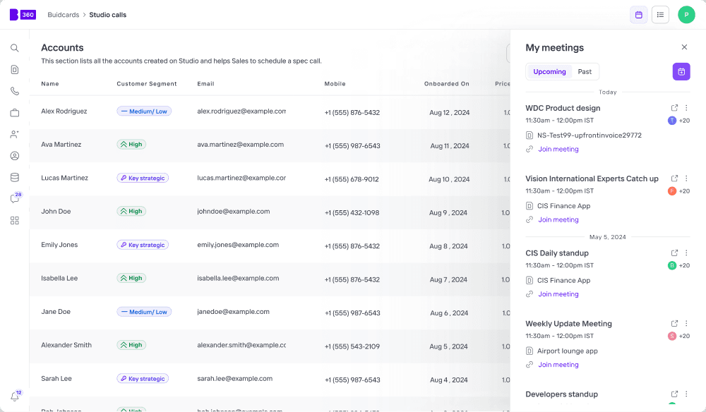
FEATURE - MY MEETINGS IN HEADER
FEATURE - MY MEETINGS IN HEADER
In order to create and view meetings of each project (Buildcard) the user has to go to the home page > select that buildcard > go to meetings > and then create meeting inside that particular buildcards’s page. This process is very cumbersome specially when the user has to manage multiple projects/ buildcards. So I introduced a global My meetings section where users can see their meetings. From here, they can also create meetings for any project/buildcard they are a handling.
In order to create and view meetings of each project (Buildcard) the user has to go to the home page > select that buildcard > go to meetings > and then create meeting inside that particular buildcards’s page. This process is very cumbersome specially when the user has to manage multiple projects/ buildcards. So I introduced a global My meetings section where users can see their meetings. From here, they can also create meetings for any project/buildcard they are a handling.
In order to create and view meetings of each project (Buildcard) the user has to go to the home page > select that buildcard > go to meetings > and then create meeting inside that particular buildcards’s page. This process is very cumbersome specially when the user has to manage multiple projects/ buildcards. So I introduced a global My meetings section where users can see their meetings. From here, they can also create meetings for any project/buildcard they are a handling.
Old site architecture
Old site architecture
New site architecture
New site architecture


RESULTS
RESULTS
After collaborating closely with engineering to bring the designs to life, we launched the release in June 2024 and hoped for the best. From the start, we identified two key success indicators: improved keyboard accessibility and enhanced user experience. Fortunately, users reported a smoother experience, and we saw a noticeable decrease in scheduling-related issues on our support channel.
Here are few responses we got from our users post launch:
Cara Pierra (Technical Product Manager at Builder.ai):
“ It's been such a help! The attention to detail has been great - like organising experts by skill and having time zones. A big thank you! ”
Sunny Chalkapurkar (Technical Product Manager at Builder.ai):
“ This new UI is really nice and makes me want to use that section much more now! Great job here ”
Joost Van Heesbeen (Technical Product Manager at Builder.ai):
“ New meetings section is much much better, thanks so much!! ”
LEARNINGS
LEARNINGS
By actively listening to our users and making meaningful changes, we significantly improved the meetings section, enhancing the overall user experience. Through this process, I grew as a designer and walked away with several takeaways:
User feedback is crucial: Even if you're already aware of an issue, feedback helps you focus on specific details and gives you the backing to drive change within your organization.
Small improvements can make a big difference: Simple tweaks like allowing users to type in time fields, showing the nearest 15-minute slot, and adding a globe icon for time zones seemed minor to us but were highly appreciated by users.
Users always prefer great UX over beautiful UI: I initially questioned creating three separate input fields for participants, and the horizontal layout seemed unconventional. However, users found this approach practical and enjoyed the clarity it provided for managing different participant types.
