
Created a design system in accordance with the web content accessibility guidelines
WCAG
Nov 2024
Intro
As of 2024, 88% of websites still fail to meet basic accessibility guidelines. Design systems are apparently the best solution to move the needle upward. By adopting accessible design systems, more designs can align with these essential criteria, creating a better digital experience for everyone.
Accessibility isn’t just a requirement—it’s a practice that ensures the web is inclusive and usable by all. Rather than seeing accessibility as something enforced, it should be celebrated for the benefits it brings to everyone, improving usability, equity, and overall design quality.
Link to design system: https://www.figma.com/community/file/1465281271016060279/accessible-design-system
My Role
Design System Designer
I conducted in-depth research on the WCAG guidelines and focused on creating a design system that prioritizes quick wins, practical, impactful solutions to make accessibility improvements faster and more efficient.
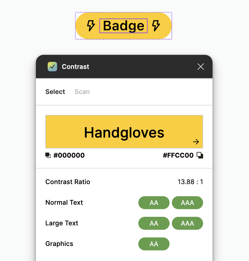
Color contrast
Many UI components suffer from low contrast between background and foreground elements, making them difficult to read. I addressed this by incorporating accessible color palettes into the design system, as this was one of the easiest and most impactful wins.

Avoiding reliance on color alone
Relying solely on color to convey information can exclude many users. I ensured accessibility by adding alternative indicators.
Error States: Instead of only highlighting an input field outline in red, I included an exclamation icon to make errors more noticeable.

Data visualizing charts: For charts and graphs, I supplemented color with patterns and shapes to differentiate between elements effectively. So that people with varying color sensitivities can interpret the charts accurately. Examples of tritanopia and deutreranopia conditions are provided below to highlight the importance of this approach.


Inclusive copywriting
Thoughtful language plays a crucial role in accessibility. I emphasized sensitivity in the copy, such as using "View More" instead of "See More," to ensure inclusivity for individuals with visual impairments.
Text
While browsers allow users to scale text, it's essential to use appropriately sized and legible fonts by default. I prioritized visible text sizes that are neither too small nor difficult to read. Also used colors that have accessible contrast with the background for text. This helps in promoting better experience for all users.
Next steps
I want to make this design system a one-stop solution, with all the essential components available here. I’m actively adding more components to make it comprehensive. My goal it making accessibility a natural and seamless part of design systems while maintaining high-quality, and functional components.
Some believe accessibility limits creativity, but that couldn’t be further from the truth. Designing for accessibility pushes us to think more creatively, resulting in solutions that are impactful.
The goal of accessibility is simple: to make design usable for everyone, just as it’s meant to be.